
Recently I got myself into this problem: When I deployed my website on mobile it looked like zoomed out as if the whole webpage is trying to fit into the phone. Although I created separate views for smaller devices still on mobile the view was shitty.
Design
| ----------------------What I designed--------------------- | ---------------------What I got---------------------- |
| ---------------------------------------------------------- | ----------------------------------------------------- |
|
 |
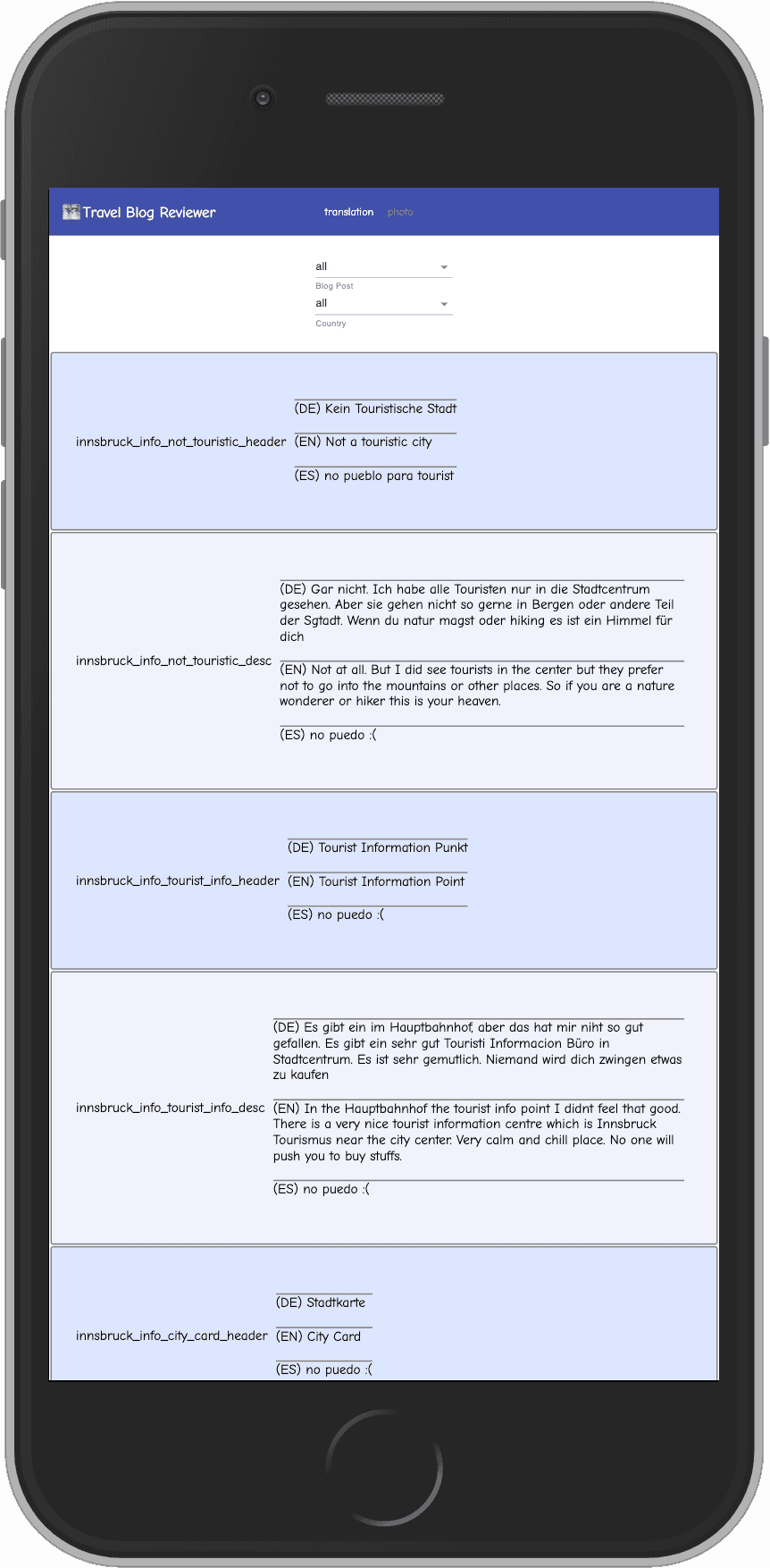 |
Solution
Interestingly the solution was to look for a way to tell browser not to try to zoom out to fit everything in one page.
There is a special Tag you need to use to let browsers know about this. Its called viewport. After adding it the Problem was fixed
<!DOCTYPE html>
<html lang="en">
  <head>
    ....
    <meta name="viewport" content="width=device-width, initial-scale=1" />
    ...
  </head>
  <body>
    <div id="root"></div>
  </body>
</html>